

Mapify is a 21st-century travel company that enables people to experience local and authentic travel experiences. We built a travel app for people to upload and share travel experiences while planning upcoming trips.
Mapify’s greatest skill has always been the quick delivery of new and elegant features. This resulted in an incredibly powerful tool, albeit one that was relatively cumbersome to use. Therefore, the main challenge at Mapify was to consolidate the cluttered platform, without alienating the current user base. I couldn’t start the redesign from scratch, but rather review what was vital and create from there.

First, I wanted to understand how people currently used the app, as well as their underlying goals for the platform. I interviewed people and conducted surveys to answer key questions such as: Who is our core user? And what do our users want?
I found three major areas within an app that were crucial to the user experience:
1. A highly personalised Home screen
2. A simple Search to explore specific destinations
3. And the ability to quickly access a Profile with personalised information
After validating these insights, I started ideating, wire-framing, and prototyping the solutions to these three areas.
I like to start with a pen and paper to simply get everything that’s in my head out in the real world. I think about the needed core functionalities and focus on removing the excess. However, I found it especially difficult with this project because I was trying to restructure so much into such a little space. I kept reminding myself of Dieter Ram’s methodology: “good design is as little design as possible.”

I usually take inspiration from many different sources. I find that the answers to some of the most difficult design problems lie outside the realms of direct competition. For this redesign, I looked outside the travel market and found inspiration while analysing various transportation, wallet, and health apps.
After many iterations, critiques, and reviews, I finally arrived at the screens that are presented here...

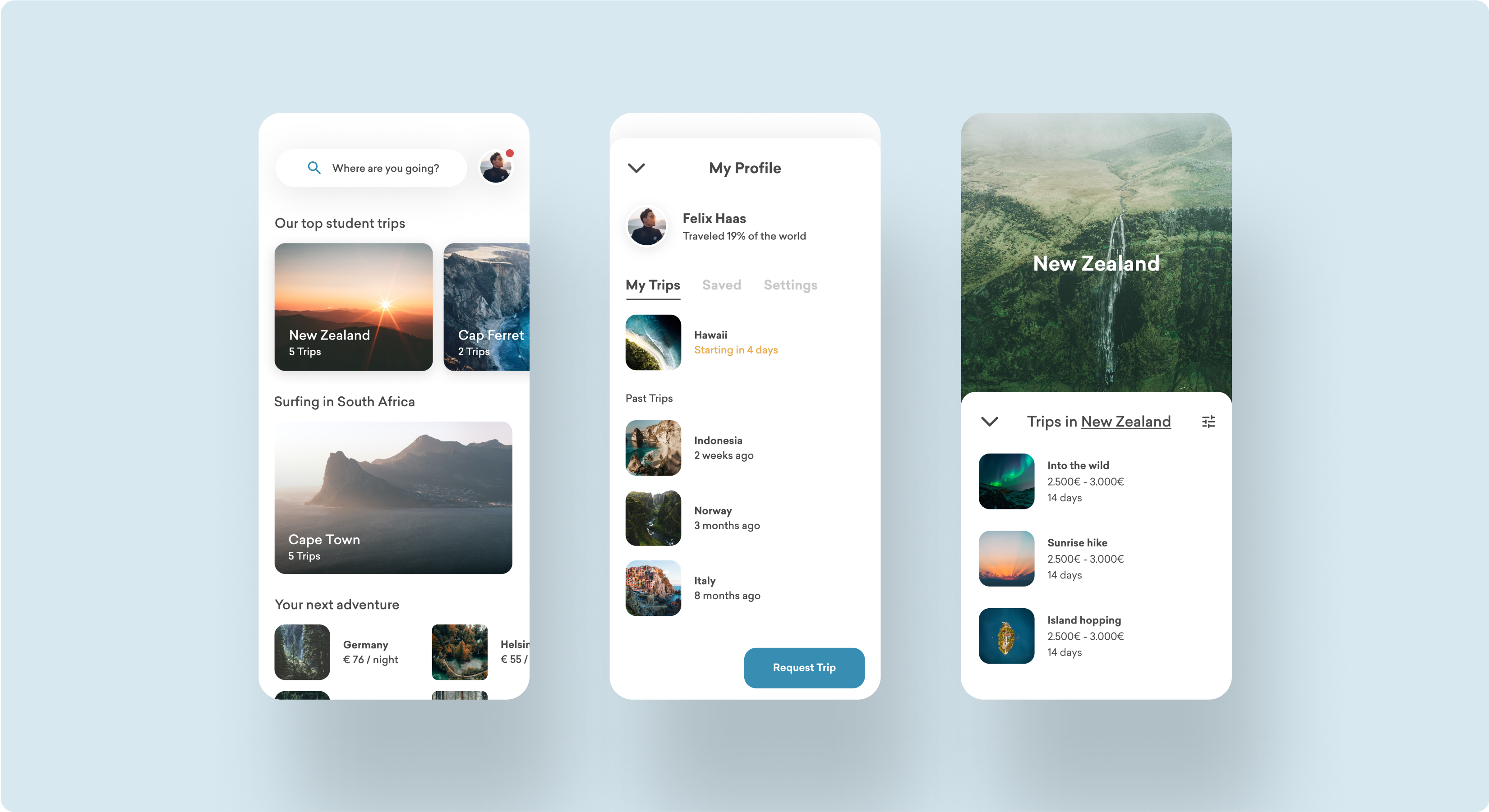
The goal of the Home was to make everything highly personalised. Users would only see relevant trips that matched individual interests and activities. Personalised content starts with the first user interaction, and we built an onboarding funnel with specific questions, such as: ‘What are your favourite destinations?’, and ‘What are your favourite types of travel?’
Additionally, I found that having a 5 tab bottom bar would make our core user group feel lost and disoriented. Therefore, I removed the bottom tab bar entirely. This radical change made the home screen much less cluttered for new users. I added a sticky search to the top of the screen, which allowed users to quickly search for a preferred destination. Last but not least, I made the profile a focal point.

The search function was continuously mentioned as one of the most used functionalities within the app. I wanted it to remain highly visible, without being overwhelming. Some people already know the destinations they are searching for, while others need a little inspiration. Instead of designing titles, I wanted to shape the user experience in a way that lets users feel comfortable clicking on suggested destinations.

With the new profile view, I wanted to make current and past trips accessible. Mapify is about YOUR travel adventures. Therefore, the profile is one of the most important views that people need to access. Here you can find everything about past trips while being able to customise specific settings and personal preferences.

In addition to the described redesign, I also set up a new design system that allowed us to keep consistency across all products and platforms. I started by creating a visual design language. This was my favourite part of the process, as it involved reflecting on color theory, typography, and layouts. We needed to build a design system that was to be used by over 10 people internally—so it needed to be clear, concise, and elegant. The entire design system is based on the atomic design methodology.


